- 972-526-5977 (Mobile)
- info@anntravesdesign.com
972-526-5977 (Mobile)
Best Paint Colors for Open Concept Homes in Dallas-Fort Worth
Every paint color in an open concept home gets noticed. There’s no hiding a bad choice. One wall flows into the next, and the wrong shade can throw off the whole space. Get it right, and the rooms feel connected and balanced. Get it wrong, and nothing feels finished.

Color Flow That Works
Walk into a true open concept home and you’ll see it immediately: colors that move with you. No sudden stops, no clashing undertones. The best spaces use a handful of shades, but they never feel repetitive. Each area gets its own identity, but nothing feels out of place. That’s not luck. That’s smart planning and a sharp eye for detail.
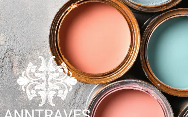
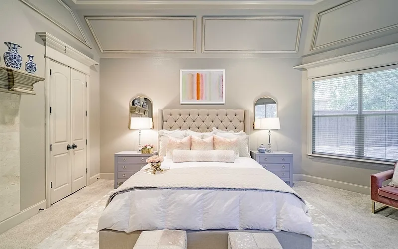
- Warm greiges like Benjamin Moore’s Revere Pewter keep things steady. They don’t fight with wood floors or stone counters. They just work.
- Cool grays such as Sherwin-Williams’ Repose Gray handle transitions. They look crisp in daylight, soft at night. No surprises.
- Soft whites, like Benjamin Moore’s White Dove, open up hallways and connecting spaces. They reflect light, never look cold, and make every room feel bigger.
- Rich earth tones ground the largest rooms. They add weight where you need it, especially in wide living areas or kitchens with high ceilings.
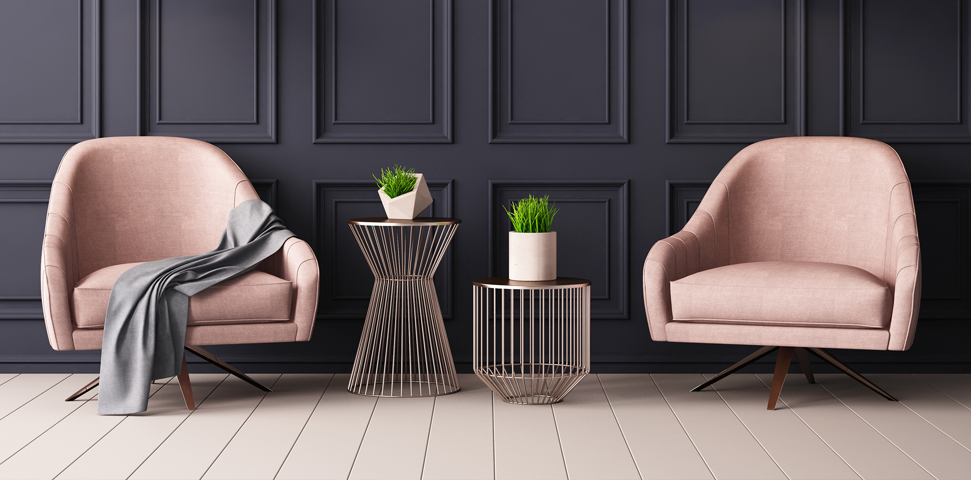
- Accent walls, when done right, carve out zones. A deep blue behind the dining table. A muted green in the reading nook. Each one signals a purpose without building a wall.
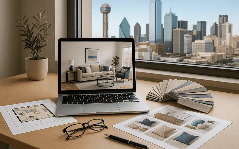
Getting this right takes more than a paint deck. Professional color consultation brings experience to the table. It’s not about picking favorites; it’s about knowing what works in real homes, with real light, and real families moving through the space.
Smart Color Choices for Dallas-Fort Worth Homes
Dallas-Fort Worth sunlight doesn’t play by the rules. Mornings can be soft and golden, but afternoons turn harsh and bright. Paint that looks perfect in the store can turn washed out or muddy by dinner. That’s why every color decision needs to factor in the way light shifts from room to room, hour to hour.
Our full-service interior design team sees this every day. A color that glows in a north-facing living room can look flat in a west-facing kitchen. The trick is to test, observe, and adjust. No guessing. No shortcuts.
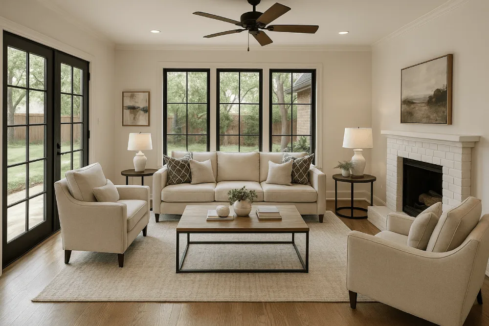
Want to define spaces without building walls? Use deeper shades in dining areas. Keep living rooms light and airy. This isn’t about trends; it’s about function. A slightly darker paint in the dining zone signals a shift. Guests know where to gather. Family knows where to relax. The flow stays open, but the purpose is clear. See it in action in these modern living room designs.
Letting Natural Light Lead
North Texas homes get more sun than most. That’s a gift and a challenge. Too much light, and colors fade or glare. Not enough, and everything feels dull. The answer isn’t just picking lighter paint. It’s about understanding how each wall catches the sun, how shadows move, and how artificial light fills in the gaps after sunset.
Working with an experienced e-design specialist makes a difference. They see the patterns, spot the trouble zones, and know which shades hold up. East-facing walls catch the morning, so soft whites and gentle grays shine. West-facing rooms need colors that don’t go brassy or yellow when the sun drops low. Every choice is tested, not just imagined. We help clients work through these challenges so their spaces look beautiful in every light.
Paints That Stand Up to Texas
Not every paint survives a Texas summer. Cheap brands fade, peel, or shift color after a few months of heat. The best residential design projects in DFW stick with proven winners. Benjamin Moore’s Decorator’s White stays true, even in direct sun. Sherwin-Williams’ Agreeable Gray doesn’t turn blue or green when the light changes. These paints don’t just look good on day one; they hold up for years.
- Decorator’s White: Clean, never stark. Works in kitchens, hallways, and anywhere you want light to bounce.
- Agreeable Gray: Flexible. Looks modern but never cold. Handles open spaces and small rooms with equal ease.
- Revere Pewter: Warm, inviting, and never goes out of style. Perfect for main living areas.
- Repose Gray: Subtle, sophisticated, and easy to pair with wood, stone, or metal finishes.
Skip the bargain brands. They don’t last. Invest in quality, and your home will look sharp long after the paint dries. At Anntraves Design, we recommend paints that have proven their durability in Texas homes, so you can enjoy lasting results.
Bringing It All Together
Big spaces need smart color choices. When rooms flow together, every wall becomes part of the story. Colors that work in one spot affect everything around them. Success comes from thinking it through - how light moves, where people walk, what each space needs to do. Skip the Pinterest perfect looks. Focus on colors that work in real life, day after day.
- Watch how colors change from morning to night
- Define spaces with color, but keep them connected
- Pick a few colors that work together, make them count
- Choose paints that stand up to Dallas sun
- Get professional help to nail it first time
Transform Your Open Concept Space
Ready to enhance your home's aesthetic? Contact Anntraves Design at 972-526-5977 or schedule your consultation to find the perfect color palette for your open concept space.
‹ Back
Recent Posts
-
Matte Paint vs Satin Paint: Understanding the Difference
February 5, 2026
-
Best Paint Colors for Open Concept Homes in Dallas-Fort Worth
October 22, 2025
-
How Real Estate Staging Helps Sell Homes Faster in Dallas
October 8, 2025
-
Should You Choose E-Design or Full-Service Design in Dallas
September 24, 2025
-
How to Make Small Rooms Feel Bigger Without Remodeling
September 10, 2025


Site by